No site found for btvca-curriculum.herokuapp.com; using Bootcamp content.
Responsive Layout
- "Responsive" means that the layout changes and responds based on the width of the screen
- This allows for specific layouts for mobile phones, tablets, screen readers, and more
- Layouts can be redered conditionally based on:
- Screen size
- Pixel density
- Screen orientation
- Height/Width Ratio i.e. 11:9
Question: Why might this be important?*
What is Responsive Development?
- Responsive development is a technique that displays content well regardless of the device it is being viewed on
- This concept is increasingly important, not all users are desktop browsers
- In 2017 and 2018 more than 50% of web traffic was from mobile devices
Responsive Layout: Media Queries
- CSS3 introduced media queries, which allow developers to apply CSS properties to devices which match rules
- Media queries are the backbone of front-end responsive development with HTML and CSS
- Applying CSS to specific screen widths allows for changing the layout and styles based on the size of a device
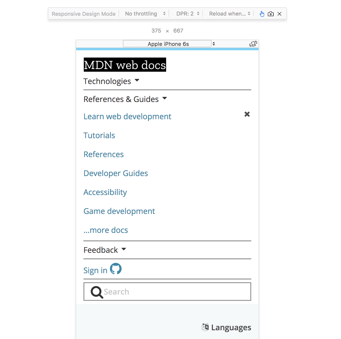
Mobile Device Simulator

Using Media Queries
- Media Queries (
@media (some_condition) { }) cause different CSS rules to be applied on different screens
Example
This will make our .nav element position relative when the media type is print
// Default position layout

.nav {
  position: absolute;
}

// Print media only layout

@media print {
  .nav {
    position: relative;
  }
}
Media Features
Each feature is a characteristic of the user-agent
| Query | Description |
|---|---|
| width | the width of the viewport |
| all | TRUE if the device responds to media queries |
| resolution | Pixel density of the output device |
| color | Number of bits per color component of the device |
| pointer | Is the primary input mechanism a pointing device |
| hover | Does the primary input mechanism allow the user to hover |
Media Query Conditionals - AND
Only change the layout to position: relative; when
- The media is
screen - AND
- The screen width is greater than or equal to 768 pixels
@media screen and (min-width:768px) {
  .nav {
    position: relative;
  }
}
Media Query Conditionals - OR
NOTE: OR is the , (comma) in a Media Query
Only change the layout to position: relative; when
- The media is
screen - OR
- The screen width is greater than or equal to 768 pixels
@media screen, (min-width:768px) {
  .nav {
    position: relative;
  }
}
Mobile-First Development
- Developing mobile first means to start styling out your web page for a mobile device, and then modify the layout for a desktop browser
- The result of this is modifying your CSS as screen sizes increase, rather than modifying your CSS as screen sizes decrease
- In other words, your media queries will be written for minimum widths, not maximum widths
- Tip: You can also set media queries in-between two screen sizes
Lab: Shift It Around
Remember our old friend example-html? Let's bring it back for one final lab.
Here we have a page that is starting to look somewhat decent, but what happens when you squish the screen down?
In this lab we are going to make the index.html page look good at any size. Feel free to use flexbox, and/or grid while you complete the following tasks for mobile view (screen width < 450px)
- Lay your nav bar out vertically
- Don't wrap the text around the images
- Decrease the space between elements
- Resize the images, and iframes so they fit the page.
- Remove the background image, or use a different (smaller) background image