CSS Layout

(CSS is Awesome mug created by Steven Frank, still available for purchase on Zazzle)
Inline vs. Block Level Elements
This is where things start to get a little bit tricky - positioning HTML elements using CSS.
There are two main display rules (or "levels") for HTML elements.
- Block level
- New line, full width
- Inline level
- Same line, width of content
Inline vs. Block: More Info
Inline elements should only contain data, or other inline elements.
Block level elements can contain both block and inline elements.
CSS Display Property
Elements are given a default display value based on their type - this is a CSS property that determines an element's layout, and how it interacts with other elements.
-
display: block;- The element will take up the full width of the page
-
display: inline;- The element will only take up the width of the content within the element.
-
display: inline-block- Acts as an inline element, but can be given a specific width and height.
-
display: none;- The element will disappear, as will all its children, and its neighbors will be rendered as if it was never there.
See https://developer.mozilla.org/en-US/docs/Web/CSS/display for many more display values.
Example of Block vs. Inline Elements
Inherent display properties of commonly-used HTML elements.
| Block Level Elements |
|---|
| div |
| p |
| table |
| form |
| ul, ol |
| nav |
| Inline Elements |
|---|
| span |
| a |
| i, em |
| b, strong |
| img |
| button |
Positioning
There are 4 commonly-used position properties in CSS. These further help to position elements on a page. They also help to further confuse you as a developer.
-
Relative - Elements are relative to the flow of the HTML document.
- Elements moved around with the properties top, left, right, bottom.
top:20px;will move a relatively positioned element 20 pixels from its natural postioning.
- Elements moved around with the properties top, left, right, bottom.
-
Absolute - This is positioned relative to its parent or ancestor (closest ancestor that is relatively positioned).
- Any element that is positioned absolutely, will be placed (using the top/left/right/bottom CSS properties) specifically within the parent, irrespective of other sibling elements.
mnemonic: positions are opposite of their common meaning
- "position: relative" means "my children are positioned relative to me"
- "position: absolute" means "I am positioned relative to my parent"
Positioning (cont.)
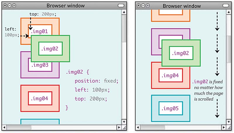
- 3. Fixed - Position an element is relation to its viewport (browser window).
- 4. Static- Same as relative, but cannot be moved with top/left/right/bottom. It is relative to the flow of the HTML document.
position: fixed example: 
Wrapper DIVs
In order to make content layout work in CSS, you often need to introduce wrapper divs.
For example, if you have an image with its own caption, and you want them to appear together and also have the caption positioned relative to the image, you might need to change this:
- cow html - raw
<img src='cow.jpg'>
<p class='caption'>This is a cow.</p>
Into this:
- cow html - styled
<div class='image-wrapper'>
  <img src='cow.jpg'>
  <p class='caption'>This is a cow.</p>
</div>

<style>
  .image-wrapper {
    position: relative;
  }
  .image-wrapper .caption {
    position: absolute;
    bottom: 0;
    margin: auto;
  }
</style>
Floats (Intro)
- Floats, to say the least, are weird and can be frustrating.
- It used to be that floats were the only way to achieve specific layouts using CSS, especially:
- stacking left-to-right or right-to-left
- forcing an element to be as wide as its contents, not as wide as its parent
Floating Cow
<style>
  .image-wrapper {
    position: relative;
    float: left;
  }
</style>
- cow float html - styled
Now the caption can be as wide as its parent (the wrapper), since its parent is only as wide as its content (the image).
Float
| Float Properties |
|---|
| left |
| right |
- Applying the style
float:left;to an element will force that element to the left side of the container, and all other elements will 'wrap' around it.

TIP: applying
clear: bothto an element will make it skip down the page past all floats, left and right. This is usually done to a<br>
Float Explanation Video
YouTube user: tobyonline; Published on Dec 19, 2013; https://youtu.be/xara4Z1b18I
Floats (Advice)
- For a long time, floats were the backbone of page layout using CSS.
- However, recent developments have allowed developers to use new CSS properties to achieve the same result, and much more.
- Because of this, the
floatproperty should only be used for wrapping text around images, which was its original purpose - gone are the days of CSS layout using floats.
LAB: Image Wrapping
Let's open our trusty "example-html" directory once more.
You should currently have two HTML files in this directory.
-
index.htmlwith a navigation section, a fair bit of text, some images, and a couple videos -
about.htmlwith a header, and a link back to the home page
In this lab we'll be focusing on the index.html file, so open that up in VSCode
- Add a
styletag at the top of the html document'sbodysection - Add container
divs for each image, and give them aclassname. - In each container, on the same level as the image, add a
ptag with some text in it - Using the style tag write some CSS to wrap the text around the images.
Lab: Make It Pretty
Now we've got a page with some wrapped images, a whole lot of text, and some links. Things are starting to get laid out, but our page still looks like something from the early 90s, and our navigation bar is far from ideal.
Let's spruce things up a bit!
Using the style tag we previously inserted into our index.html file do the following:
- Make the navigation section a horizontal bar across the top of the page
- Change the background color of the nav bar
- Add a background image to the main body of the page (make sure your text remains legible)
- Seperate different sections with some space between them