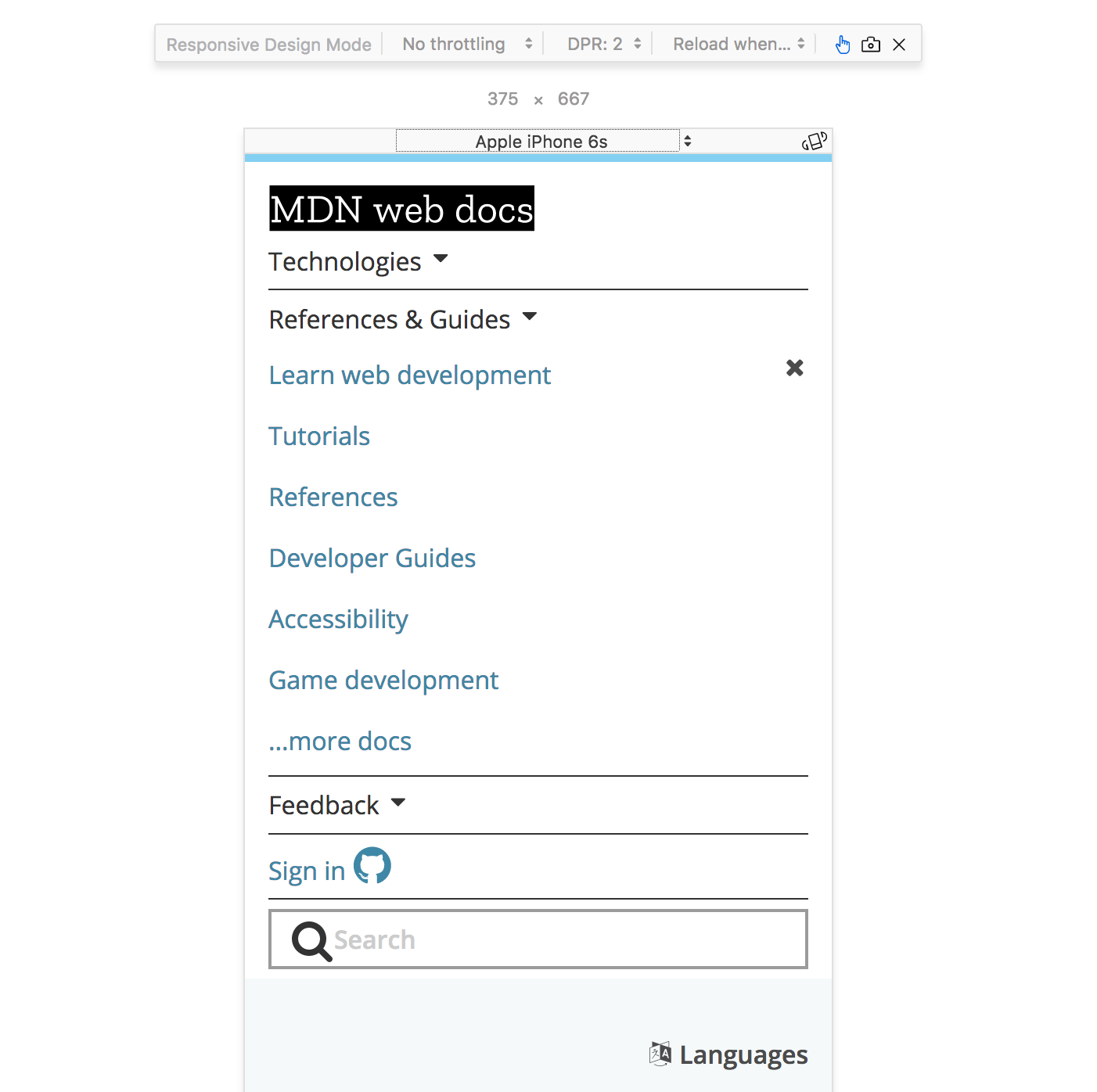
Mobile Device Simulator

Question: Why might this be important?*

@media (some_condition) { }) cause different CSS rules to be applied on different screensThis will make our .nav element position relative when the media type is print
// Default position layout

.nav {
  position: absolute;
}

// Print media only layout

@media print {
  .nav {
    position: relative;
  }
}
Each feature is a characteristic of the user-agent
| Query | Description |
|---|---|
| width | the width of the viewport |
| all | TRUE if the device responds to media queries |
| resolution | Pixel density of the output device |
| color | Number of bits per color component of the device |
| pointer | Is the primary input mechanism a pointing device |
| hover | Does the primary input mechanism allow the user to hover |
Only change the layout to position: relative; when
screen
@media screen and (min-width:768px) {
  .nav {
    position: relative;
  }
}
NOTE: OR is the , (comma) in a Media Query
Only change the layout to position: relative; when
screen
@media screen, (min-width:768px) {
  .nav {
    position: relative;
  }
}
Remember our old friend example-html? Let's bring it back for one final lab.
Here we have a page that is starting to look somewhat decent, but what happens when you squish the screen down?
In this lab we are going to make the index.html page look good at any size. Feel free to use flexbox, and/or grid while you complete the following tasks for mobile view (screen width < 450px)
/